Dove Family Dentistry
Dove Family Dentistry
Dove Family Dentistry is a cosmetics dental office in Puyallup, WA. At Dove Family Dentistry they take the time to listen to patients to find out what they want, whether that means simply maintaining their smile or doing extensive cosmetic work.
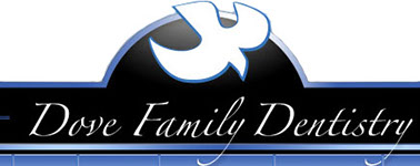
Problem
The current signature is generic and out of date. The typography is thin script that is potentially hard to read on different applications such as web pages, or signage. The currently dove icon represents stock clip art, and is in a descending position which gives the signature a sense of uncertainty. Both the icon and typography are knocked out of heavy colors.
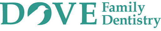
Solution
Create a flat easy to read, easy to see signature. Give the icon a sense of purpose and certainty with in the design. The signature will have more balance in the name to make it not look like a Dove family owned office.

Logo Re-Design